How to Design a Logo

Have you even heard a common person define logos? It goes something like this: “It’s circle like thing with company’s name written under it.”
Honestly, a logo is much much more than that. A logo is the identity of the company. A logo is the artistic representation in of the ideology of the mother firm. A logo’s shape, color and font reveals the psyche of the business. A logo is much more than a circle like thing!
Honestly, a logo is much much more than that. A logo is the identity of the company. A logo is the artistic representation in of the ideology of the mother firm. A logo’s shape, color and font reveals the psyche of the business. A logo is much more than a circle like thing!
Logo design is a science but today, we’re not focusing on the science but rather the simple fundamental stuff that even grandma can understand easily.
Today’s is intended for small business owners, service providers, and everybody who is thinking of making a logo.
Relevant: Free Logo Generators
Let’s start by understanding what a logo is and how it is designed.
How to Design a Logo: Method in the Madness
A logo represents your company through fonts, shapes and colors.
A font that can create a beautiful logo for a beauty product will spell disaster for a law firm’s logo. Choosing fonts is mostly commonsense but colors can get a little tricky.
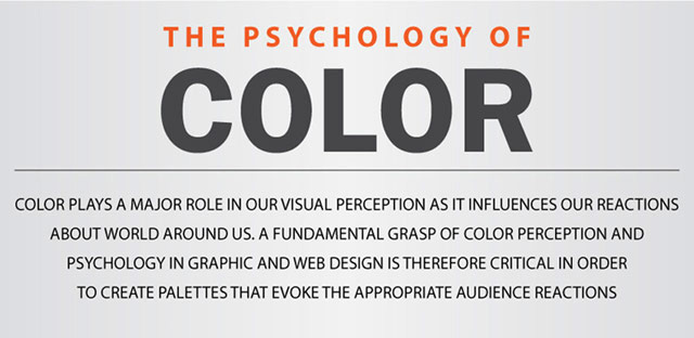
Relevant: Color Psychology Info-graphicRelevant: 50 Free Logo Fonts
Once you have a knowhow of the colors and fonts to use, now comes the most important part. Creating the idea, the message your logo should hold.
The Message in the Logo
Once figure out what is the message this logo should contain, 50% of the work is done. This is the most critical decision in this whole logo making process. Just imagine if you could choose your face, just like you choose your shoes or clothes… but once chosen, the face cannot be changed. Just imagine how much thought you would give to that decision. Just like that, logo is the face of your company, choose it, and create it with great care.
According to famous designer and writer David Airey, a good logo must be:
- Describable: you should be able to describe it easily. For instance, the apple logo can described using the words “an apple with a bite taken off from the right side.”
- Memorable: probably the most important factor in a logo.
- Scalable: if you have one-inch logo, you should be able make into a 60 feet wide billboard without any problem.
- Effective without color: it should be able to Xeroxed.
Here’s quick representation of what he means.
Relevant: Logo Design Made Simple (I wrote this article for beginning designers)
A logo can only be easily describable and memorable when it is simple. When you try to do too much, you lose everything. There was a time when complex, congested logos worked but not these days, oh no!
AT&T Logo
AT&T started as Bell Telephone Company in 1877. You can see the shifting of time in their logos. The change of trends, from compressed black and white to simple and colorful.

Getting back to the real issue, which is the message.
Your logo needs a cool message. What could that be? It solely depends on your business. What you do will define your message. I have added some beautiful logos at the end of the article which define the company exceptionally well, don’t forget to check them out.
Let’s take an example from Apple Inc.
Their logo has worked brilliantly over the years. It is not only the one of the most memorable logos but also one of the most iconic and successful ones.
Their logo has worked brilliantly over the years. It is not only the one of the most memorable logos but also one of the most iconic and successful ones.
Apple Inc. Logo
In the famous apple logo, there’s one bite taken off from the fruit. Can you guess who took that bite? Yes, you are right. This refers to the biblical story of Adam and Eve and the “Tree of knowledge”. So the message is that Apple Inc. products are actually fruits from the tree of knowledge. Now that’s quite a message!
Relevant: Famous Brand Logos and Their Information
Things to Remember
Whether to include your company name in the logo or not? This is a tricky question. Some of the most famous logos in the world do not include a company name. On the other hand, there are some major brands, like Canon which contain a very readable typographic logo and no symbol or shape. Once again, this is a decision you’ll have to take alone.
The thing that you should remember is that if your company is a short one, maybe six characters or less, then you can think about going for a typographic logo, otherwise go for a symbol or shape. In fact the current trend is that everybody is trying to for symbols instead of typography, here’s an example.
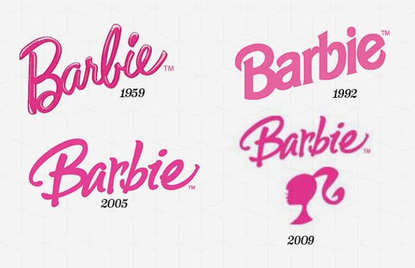
Barbie
Text is only good if you are working in a limited market. When you go global, you better create a symbolic language because English alphabet can be confusing in other languages or people just might not know English.
Today, with this new logo intact, three barbie dolls are sold every second.
Today, with this new logo intact, three barbie dolls are sold every second.
Conclusion
You need to know the message. If you don’t have any message, you will need a very high priced logo designer who creates a classy message for you.
Can you design the logo yourself? Well, if you have an artistic bone, you can. But, it is always better to get a specialist do these things. Just like sometimes when you are ill, you sometimes treat yourself but it is always advisable to visit a doctor instead.
If I should hire a designer, why did I read all this? Because these are the things you need to know before you go to a designer. You should know what are the trends, you should know in what manner will he be thinking and you should know what is good for you. Designers can also falter, and when they do, you should be able to rectify the problem.
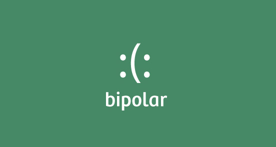
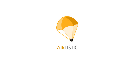
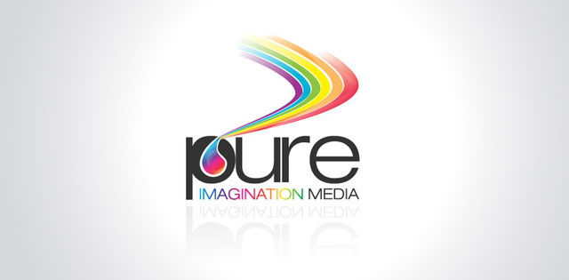
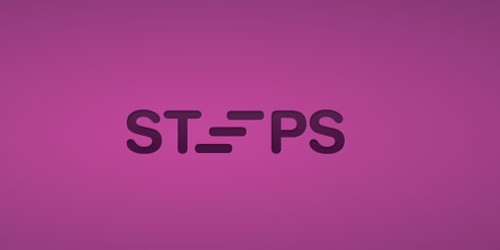
SMART LOGO DESIGNS
We published a collection of 60 really smart company logos. The following are a few logos from that post.


Source: http://www.designzzz.com/how-to-design-a-logo/
No hay comentarios:
Publicar un comentario