25 Modern Packaging Design Ideas
Advertisements
Fresh and inspiring packaging ideas can make a big impact to increase awareness and sales in modern world. Modern packaging is the technology of enclosing or protecting products for distribution, storage, sale, and use. When you need to get a lot of attention for little money, make eye-catching, attractive, modern beautiful packaging design of your product.
In this post we are gathered a showcase 25 modern packaging design ideas & concepts for inspiration. So enjoy the inspiring designs and let us know by commenting below:
You may be interested in the following modern trends related articles as well.
In this post we are gathered a showcase 25 modern packaging design ideas & concepts for inspiration. So enjoy the inspiring designs and let us know by commenting below:
You may be interested in the following modern trends related articles as well.
- 17 New Free Fonts For Desigenrs
- 35 Modern UI Concepts and Designs
- 26 Modern Packaging Design Concepts
- Fresh Collection Of Creative Photos (35 Photos)
Please feel free to join us and you are always welcome to share your thoughts.
Subscribe to ourRSS, follow us on
Twitter and
Google+ for updates.
Modern Packaging Design Ideas & Concepts
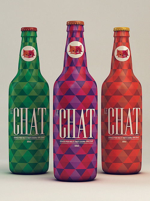
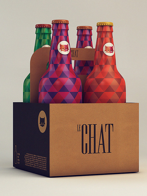
Excellent product research is key to any packaging design. Sussing out your competitors, their income, their resources spent and finding out the consumer opinion on these packaging design is essential. Only once you have all of this information at the tips of your fingers, can you let yourself design to your hearts content.Le Chat
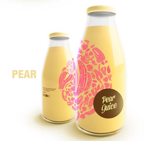
Le Chat – A french brewer that loves to think outside the box.Lettering and Packaging Project
Greating styling packaging which echos the fresh feels from the product.Milko
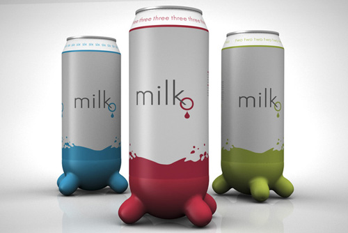
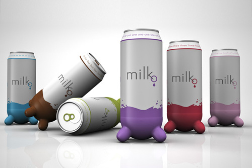
When I was taking a workshop of creativity at the master of packaging design at ELISAVA in Barcelona. Professor David Espluga ordered us a redesign of mass consumer product. The product I chose was the pack of milk, because it’s an essential product in every home. And I think that it can be different and funny that permit you make a collection of them and not just a storage pack.Paromi Artisan Tea Company
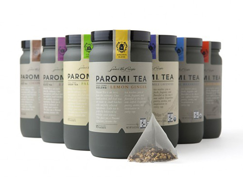
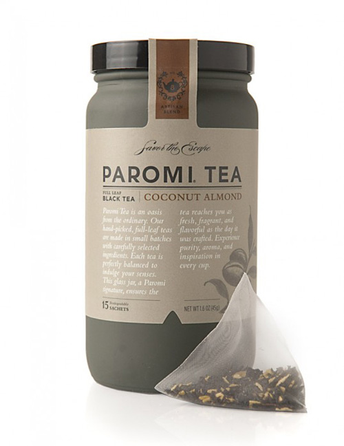
Paromi Artisan Tea Company came to R/West looking for a complete brand overhaul. Their product was premium and unique, but lacked shelf presence and storytelling. Through new packaging, including a custom glass bottle, we painted the picture of Paromi’s worldwide search for unmatched ingredients. The brand revival made an immediate impact as Whole Foods picked up Paromi across most of the continental United States.Bob Studio’s Original Super Beer
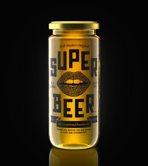
A special packaging design for the ‘Super Beer Tournament’, the 1st foosball tournament of last season that took place in Bob Studio, in October.DAS KORN
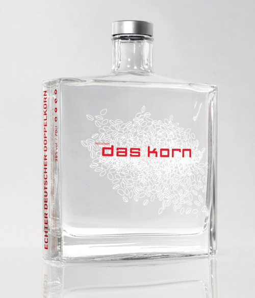
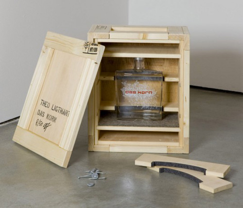
DAS KORN (The grain) was designed by kakoii Berlin for the German Artist Theo Ligthart. The idea was to re-brand the typical German liquor made of wheat grain with its perception of cheap alcohol as a super premium brand.Crown Maple
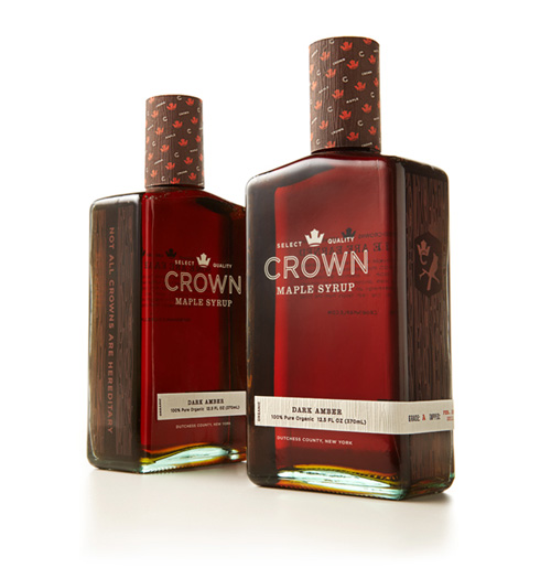
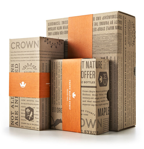
Introducing Crown Maple, a new brand of distinctive maple syrup from Dutchess County, New York. Studio MPLS created a distinctive brand identity, visual brand language, and package design for a future, limited-edition product for the world’s first brand of super-premium maple syrup.Basin
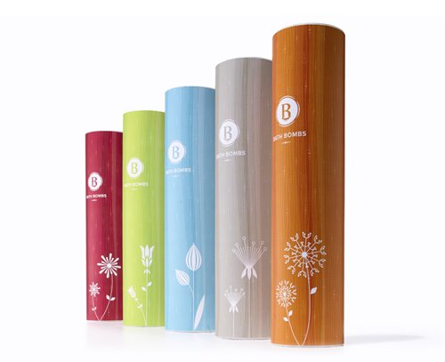
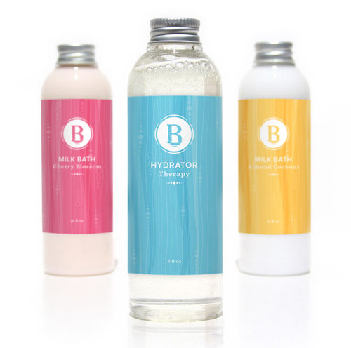
Basin pioneered the category of handmade, natural, and indulgent bath and beauty products. After a more than a decade of sustained success at upscale shopping malls and at Disneyland and DisneyWorld, Basin prepared to open its first retail outlet in the most dynamic city in America: Las Vegas.Salon Modern
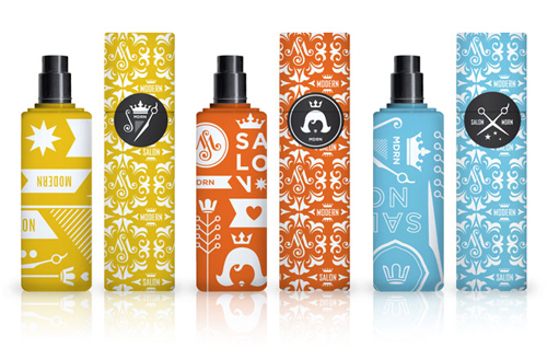
Salon Modern is a new upscale salon cooperative where stylists can invite their own clients into an intimate, personal environment that inspires, refreshes and rejuvenates. Nothing chain-like, nothing cookie cutter, Salon Modern is a one-of-a-kind experience designed to bring out the beauty and style of its patrons.Interapothek
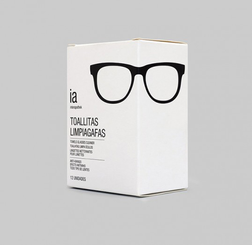
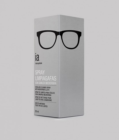
Playful packaging for Spanish optical brand Interapothek. Products include towel glasses cleaner, eyeglass cleaner spray, and multipurpose solution for all type of soft contact lenses.Ikaati
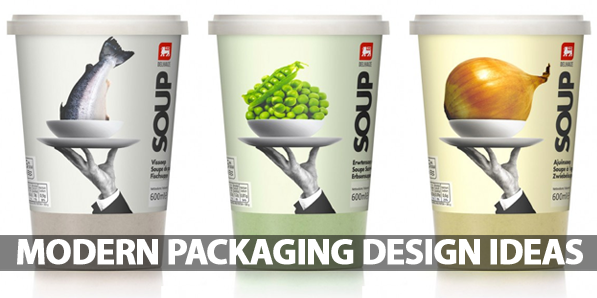
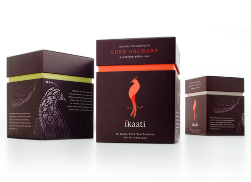
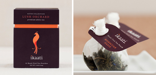
Inspired by authentic Indonesian culture and tradition, Ikaati is a line of handcrafted teas designed specifically to enhance the luxury spa experience. Each infusion of teas is derived from organic herbs, fruits and flowers grown in some of the world’s most rarified tea gardens. The brand is a tribute to the founders’ Indonesian heritage and the teas’ handcrafted origins, as the Indonesian word ‘ikat’ literally means “to tie by hand”.Delhaize Soup
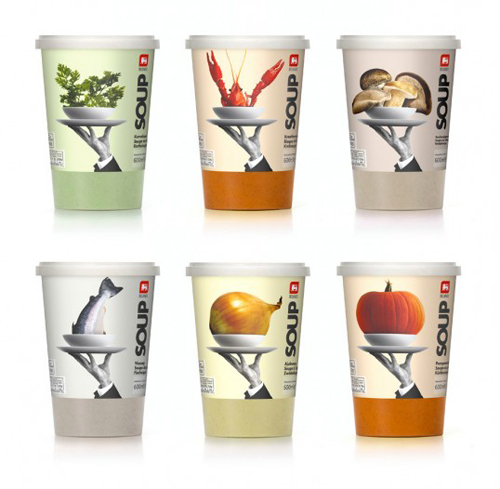
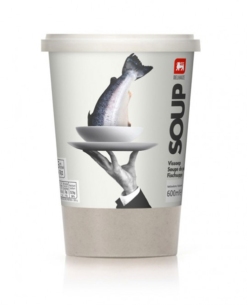
The brief was to bring to life the principle ingredient, preferably through the use photo-realistic images, with something that adds a touch of good humor before serving.Ricenoir Sake
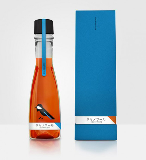
Packaging concept for local products trade fairs during the Setouchi Trienniale 2013. Inspiration for the design is a bird that occurs in areas of Japan (Parus varius). Part of his body has a similar color to the color of the product – Ricenoir Sake and has a local character.Aluminum Milk Pack
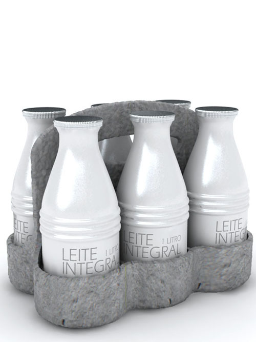
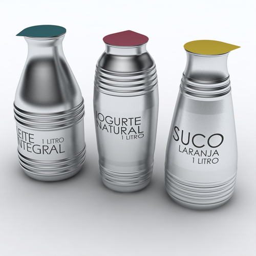
Case for 6 bottles: recycled molded egg carton like material, 100%recycled/biodegradable packaging material. Bottles: Totally recyclable aluminum one way milk packaging. This project features the aluminum due to it’s high recyclability.Sweet Botanicals
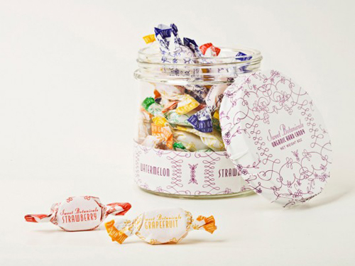
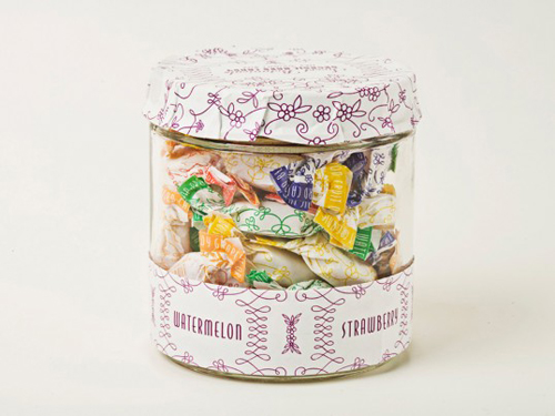
Sweet Botanicals is a line of organic hard candies of various flavors packaged in a nostalgic design from the 19th Century.Eau de Espana
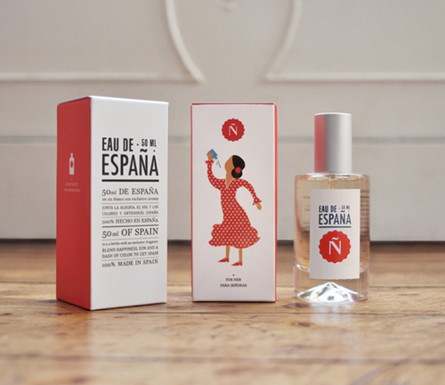
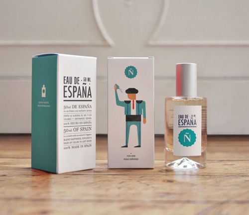
50 ml of Spain in a bottle with an exclusive fragrances. Blend happiness, sun and dash of colour to get Spain.Aveda Men
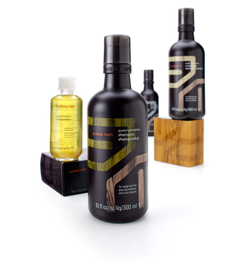
Aveda Men redoubled Aveda’s commitment to educate and inform men about their unique hair care needs. While at Duffy & Partners, we were asked to build a new Men’s brand from the ground up. Our team developed a solution that fused masculinity with a modern look and feel.Nobo invites you for tea
Although a well-known tea preparation is from about 4,000 years, and circled the whole world it is in the UK was the most famous tea ritual. It was there that was one of the most popular varieties of black tea-Earl Grey tea. To emphasize its true English character and original recipe Angielski Tea packaging directly relate to the themes drawn from the life of the lovely London.Concept: Coca-Cola Kids Edition
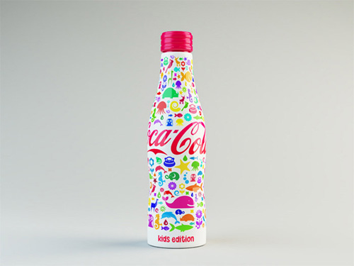
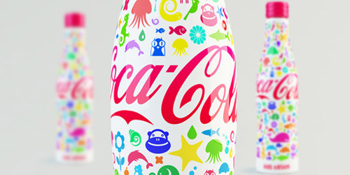
A playful concept of Coca-Cola for kids, based on the now classic aluminum bottle.24 Bottles
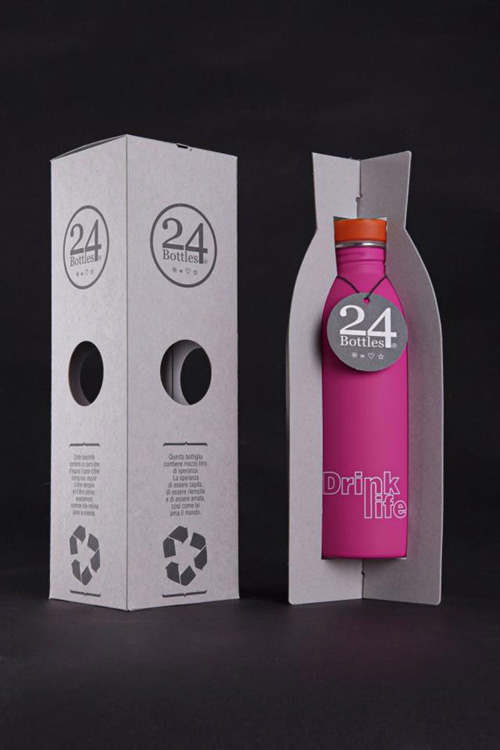
24bottles is designed to break down the barriers related to the use of plastic by imposing an ecofriendly product that aims to exploit the world purified water network as an alternative to mineral water.Microsoft Hardware Packaging
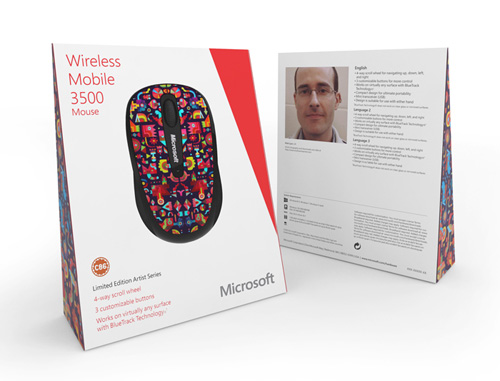
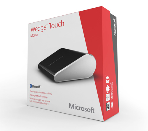
FITCH radically simplified the packaging elements, making the product the hero. This strategy engages shoppers and differentiates the product line from its competition.Yogo
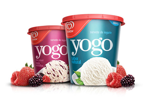
Packaging for an yogurt base ice cream for Kibon, the top ice cream brand in Brazil. It’s elegant type combined with an impactful background color throws a rupture on the refrigerated POS scenery, generating an immediate connection with the adult consumers.
Source: http://graphicdesignjunction.com/2013/03/modern-packaging-design-ideas/

Thanks for taking the time to discuss that, I feel strongly about this and so really like getting to know more on this kind of field. Do you mind updating your blog post with additional insight? It should be really useful for all of us. glass spirit bottles
ResponderEliminarvaluable information. i want to refer modern product packaging to all visitors for modern and new designs of product packaging.
ResponderEliminarGreat blog about packaging design
ResponderEliminarThese modern Packaging Design ideas are really creative and inspiring. I like how clean layouts, smart use of colors, and minimal elements come together to create a strong visual impact. Modern packaging not only looks attractive but also communicates the brand message clearly and effectively. A great collection of innovative design concepts!
ResponderEliminar