Comparing the Logo Creation Process Between Adobe Photoshop and Illustrator

So often we break down logotypes and graphic design projects solely in Adobe Illustrator. Today's tutorial produces one project in both Adobe Illustrator and Adobe Photoshop, highlighting the process of design while using similar methods in each program.
1. Sketch it Out
Step 1
I sketched out various logotypes, badge designs, and banners in my sketchbook. Although I made a whole set of designs, this tutorial will focus on one in particular: an oval design similar to beer bottle labels in its shape, but sweetened up for an ice cream shop.
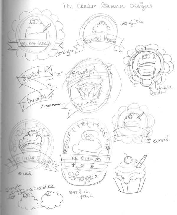
Step 2
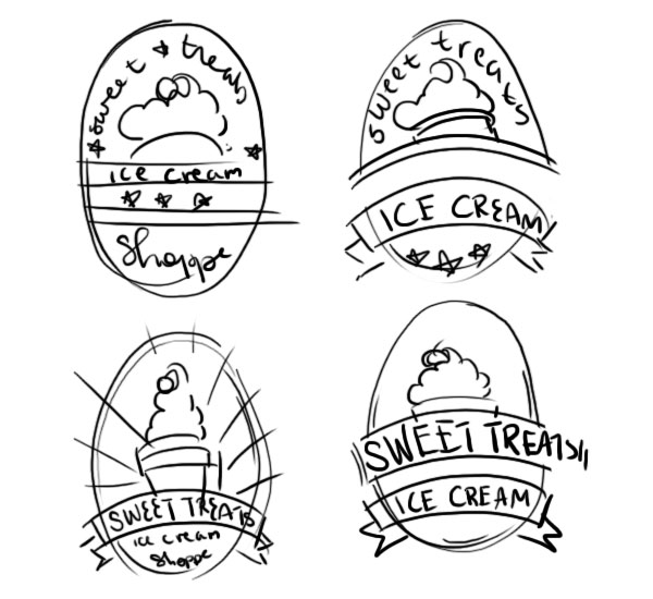
I decided on the oval design for this tutorial, and as such sketch out variations of it with banners, additional copy, and alternate design elements. I want the piece to give the viewer the information they need: brand and product type.
2. Ovals in Photoshop
Step 1
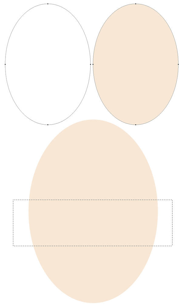
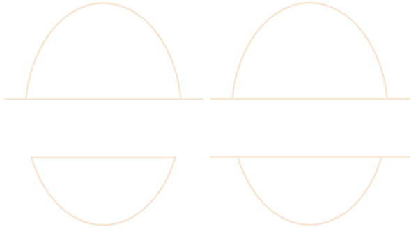
Let's start this tutorial in Adobe Photoshop CC (other versions can definitely be used, as most of the tools are present in multiple versions). Create a New Document that's about 6 inches by 8 inches at 300dpi.
Use the Ellipse Tool (U) to draw a large oval. Fill it with a light, creamy color (R: 248 G: 231 B: 213) in the Properties panel. Right-Click the shape layer in the Layerspanel, Rasterize, and use the Rectangular Marquee Tool (M) to cut out a section (see below) of the oval.
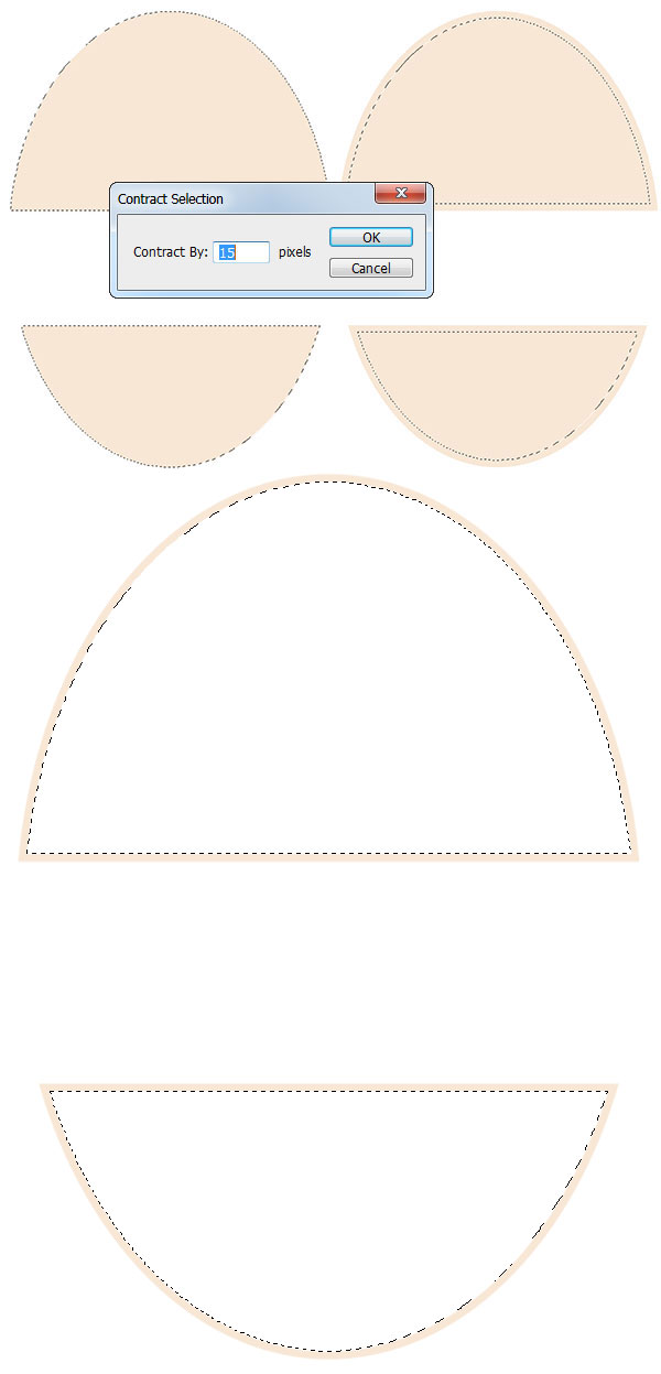
Step 2
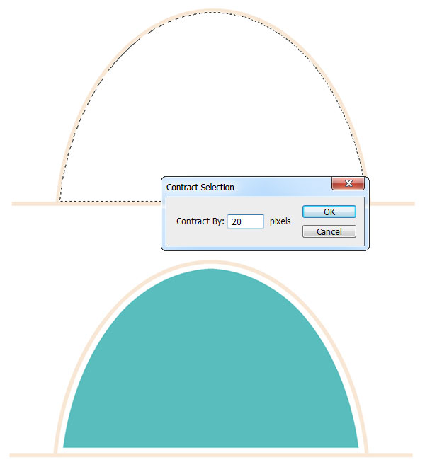
Use the Magic Wand Tool (W) to select outside of the oval halves and Invert (Shift-Control-I) the selection. Go to Select > Modify > Contract and Contract By 15 pixels. Delete the newly contracted selection from the oval halves so you're left with two outlines.
Step 3
Draw two long rectangles on the inner edges of each oval halves with the Rectangle Tool (U). You can match the exact width of the outlines by selecting each shape layer with the Direct Selection Tool (A) and defining the height as 18px. Select your shape layers and Align them to the Center with the Move Tool (V).
3. Banners and Background
Step 1
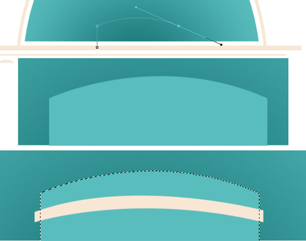
On a new layer, draw a rectangle and set the fill color to bright teal (R: 89 G: 189 B: 189). Rasterize the layer and select outside of the bottom half of the oval (switch layers, then select the teal rectangle layer again). Delete the portions of the rectangle that exist outside of the selection.
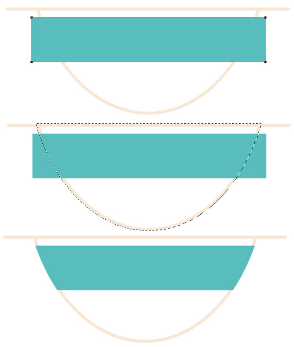
Step 2
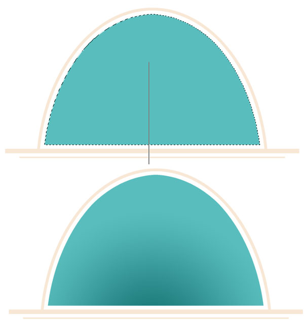
Using the Magic Wand Tool, select the interior of the top oval half. Contract the selection by 20 pixels, as was done in Section 2, Step 2. Create a New Layer and use the Paint Bucket Tool (G) to fill in the newly contracted area with teal.
Step 3
A quick shot of the logo at this point in the tutorial. Reduce the length of the lower cream rectangles and draw smaller ones in the center of the oval shapes. Make sure every element is centered.

Step 4
Select the teal oval half and make a New Layer in the Layers panel (for pieces like this, I tend to do one layer for each element of the design so they're easily changed later, much like a document created in Illustrator).
Use the Gradient Tool (G) to place a Radial Gradient that goes from dark teal (R: 18 G: 112 B: 112) to transparent within the selection (in the new layer).
4. Place Text
Step 1
The text in this design is fairly simple and straightforward. Write out your text with the Horizontal Type Tool (T). For "Sweet Treats", I used Bebas Neue in the same cream used for the outlining shapes. Move the bottom oval half elements upward so the text fits in the center of the design without extending past the top long rectangle.

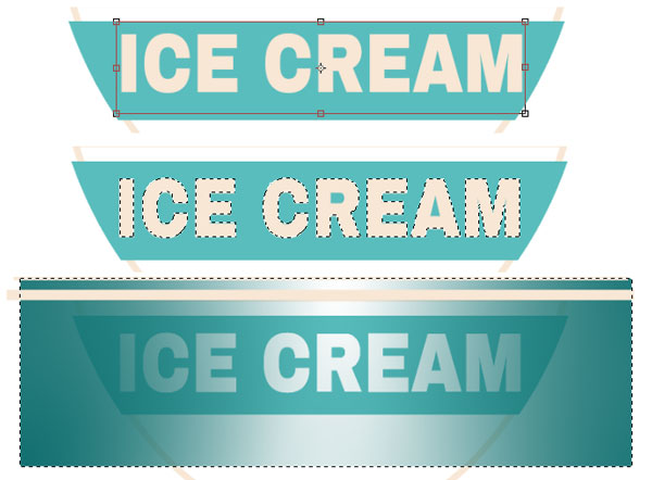
Step 2
For the "ICE CREAM" text, I used Archivo Black, written in capital letters due to its bold, blocky look. Rasterize the text layer and select the letters (make sure there is a marquee going around the inner portions of the "R" and "A") and delete the selection from the teal banner layer. Hide the text layer in the Layers panel.
Make a New Layer above the teal banner layer and use the Gradient Tool in order to place Radial gradients on either side of the banner (concentrate dark teal on the edges). Select the teal banner (in the teal banner layer) and Delete the portions of the gradient layer that do not intersect with the teal banner (as was done in Section 3, Step 1).
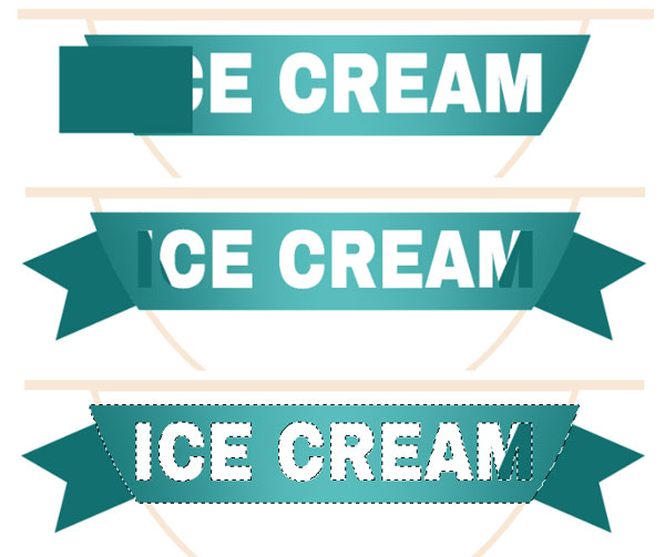
Step 3
In order to add some ribbon tails on either side. Draw a dark teal rectangle with the Rectangle Tool, Rasterize the shape layer, and use the Polygonal Lasso Tool (L) to draw a triangle-shaped selection to delete from the rectangle.
Rotate the shape 45°, or so, Duplicate the layer, and go to Edit > Transform > Flip Horizontal. Merge (Control-E) the ribbon layers together and place them beneath the ICE CREAM banner layers. Select the banner and use the Eraser Tool (E) to delete the ribbons from the text selection (see final image below).
Step 4
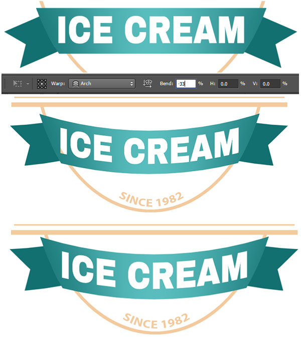
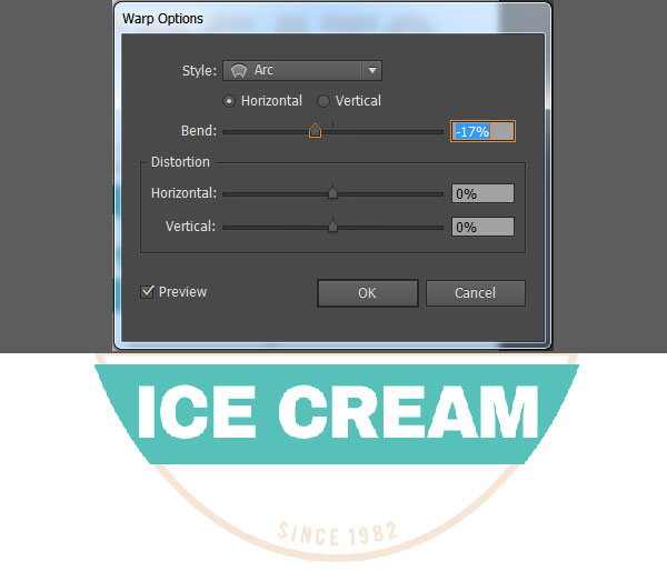
Select the "ICE CREAM" banner layers and go to Edit > Warp. Apply anArch Bend of -33% depending on your banner's placement. Move the bent banner and lower oval half upwards in the design.
Step 5
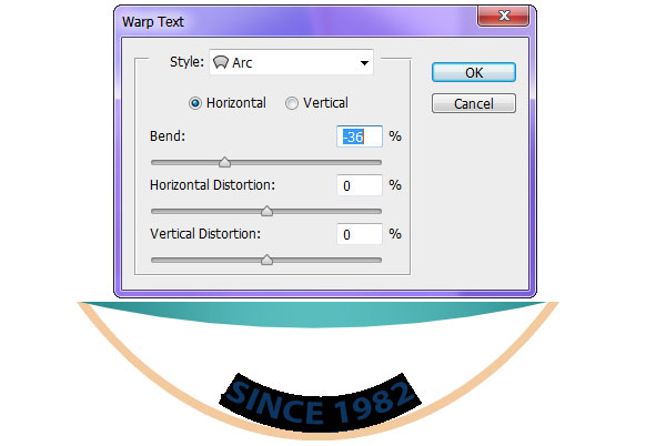
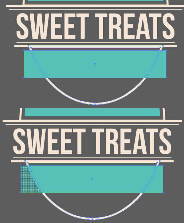
The final text touch for this design is "SINCE 1982" (or whatever year your imaginary or rather real business was established) written in bold Myriad Pro and in cream. Place at the bottom of the second oval half in 12pt or 14pt size. Select your text with the Horizontal Text Tool and warp the text in an Arc style by -36%.
5. Draw the Ice Cream
Step 1
Use the Pen Tool (P) to draw a rectangle with the top edge curved. Hold down Altto manipulate the handles while creating the curve. In the Paths panel, fill the shape with the same teal color used previously. Draw a thin, curved strip (see below), also with the Pen Tool and fill it in with cream. Delete the portions of the strip that extend beyond the cup shape.
Step 2
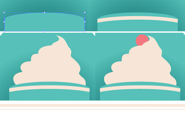
Use the Brush Tool (B) to draw a cloud-like ice cream swirl. Trace the shape with the Pen Tool on a New Layer and fill in with the same cream color used throughout the tutorial. Use the Ellipse Tool to draw a cute red cherry. Hide or Delete the drawn ice cream layer.

Step 3
Since this is on a white background, the light cream color was changed to a sweet peach. It retains the sherbet color theme but is readable against light colors. If the logo is going to be on a dark background, opt for the light cream instead.
Once finished you can Export your file or continue to design badges, banners, and logotypes for "Sweet Treats", everyone's favorite ice cream company that was made up for this tutorial. Let's move on to creating the same design in Adobe Illustrator.

6. Create the Oval and Boundaries
Step 1
Create a New Document with the same dimensions as Section 2, Step 1. Use the Ellipse Tool (L) to draw a large oval-shape and the Rectangle Tool (M) to draw a narrow rectangle that overlaps the oval. Fill both with the cream color from Section 2, Step 1. Select both shapes in hit Minus Front in the Pathfinder panel. Right-Click the compound shape and hit Release Compound Path in order to separate the
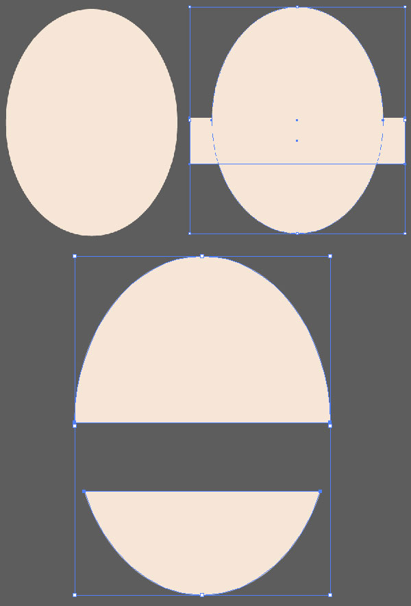
Step 2
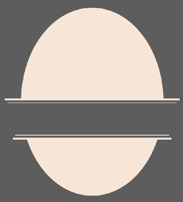
Draw four rectangles in the space between the two oval halves. Note how the top two are longer than the bottom two and the outer two are thicker than the inner two rectangles.
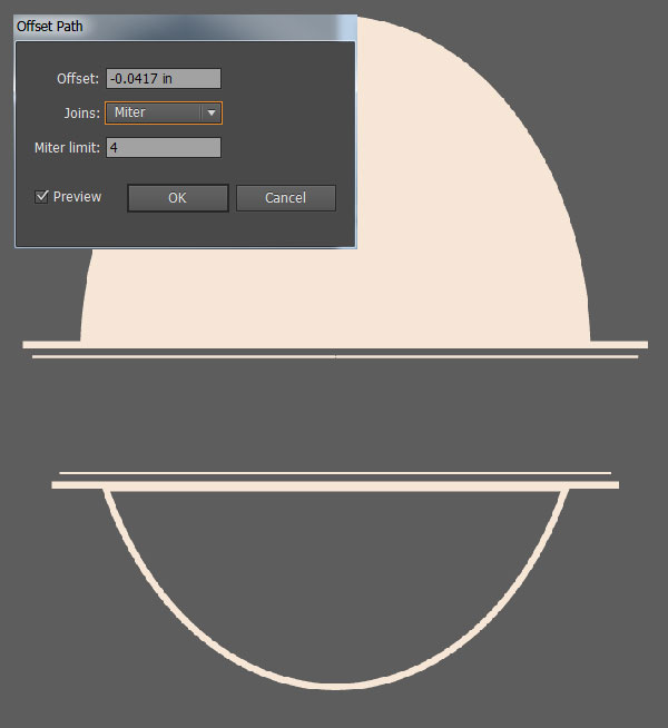
Step 3
Select the top oval half and go to Object > Path > Offset Path. Input -6px for the Offset. Select both the top oval and its offset shape and hit Minus Front in the Pathfinder panel. Repeat with the bottom oval.
7. Text and Banners
Step 1
Draw a smaller oval in the top of the cream oval half. Set the fill color to the same teal used in Section 3, Step 1, and cut off the bottom portion of it using the technique from Section 6, Step 1.
With the Type Tool, write "Sweet Treats" in Bebe Neue. Adjust the size and overall shape of the type with the Selection Tool (V).

Step 2
To create the teal banner, draw a rectangle across the bottom of the oval shape. Select both shapes and use the Shape Builder Tool (Shift-M) in order to Select the outer portions of the rectangle, Deselect, and Delete them from the banner.
Step 3
With the Type Tool, write "ICE CREAM" in Archivo Black and Expand the type under Object. Unite the type in the Pathfinder panel. Select the text shape and teal banner and hit Minus Front in Pathfinder.
Write out "SINCE 1982" in Myriad Pro. To warp the text, go to Effect > Warp > Arcand Bend the text by -17%. Place this text at the bottom of the oval.
Step 4
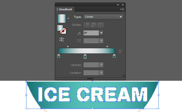
Copy (Control-C) and Paste (Control-V) the "ICE CREAM" banner and apply a gradient fill, using the Gradient panel, that goes from dark teal (Section 3, Step 4) at 100% to 0% to 100% Opacity.
8. Background, Ice Cream, and Ribbons
Step 1
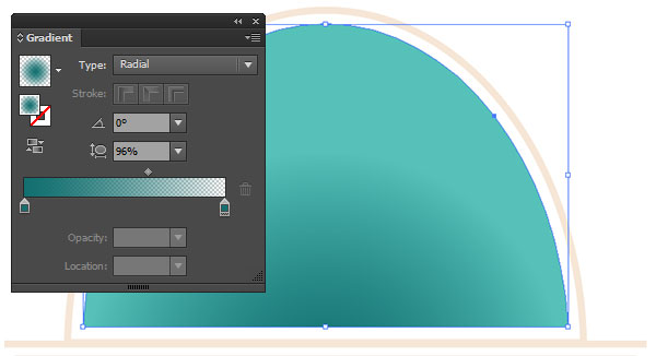
Copy and Paste the teal oval half and apply a Radial Gradient going from dark teal at 100% to 0% Opacity. Adjust the placement of the gradient with the Gradient Tool (G).
Step 2
For the sundae cup, draw an ellipse and rectangle of the same width and Unitethem in the Pathfinder panel. Use the Pen Tool (P) to draw the cream-colored curved stripe across the front of the cup. Like the process in Section 5, Step 2, sketch out the ice cream shape with the Paintbrush Tool (B) and trace it with the Pen Tool. Delete any stroked sketches from the Layers panel. Use the Ellipse Tool to draw a cute little red cherry and place it behind the ice cream shape.
Step 3
For the teal banner's ribbons, draw a short rectangle with the Rectangle Tool. Use the Pen tool to draw a triangle on the left side of the rectangle. Select both and hit Minus Front in the Pathfinder panel. Rotate the shape 45° or so. Copy, Paste, and Reflect the ribbon shape over a Vertical Axis and place on either side of the teal banner within the design (make sure it's placed beneath the banner in the Layers panel).

Step 4
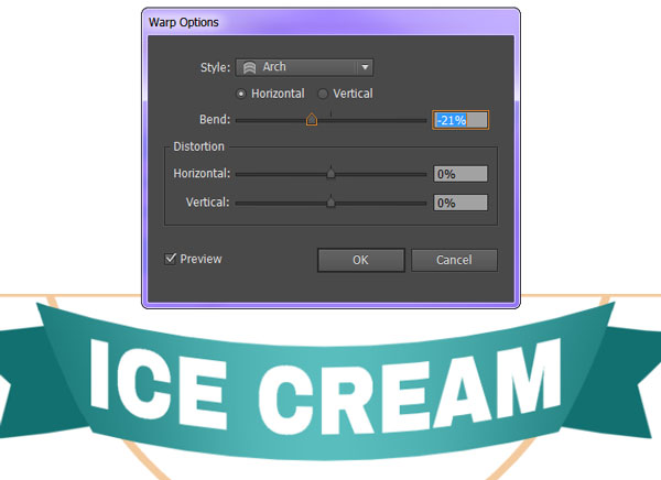
Select the "ICE CREAM" banner components and Group (Control-G) them together. Go to Effect > Warp > Arch and Bend it by -21%.
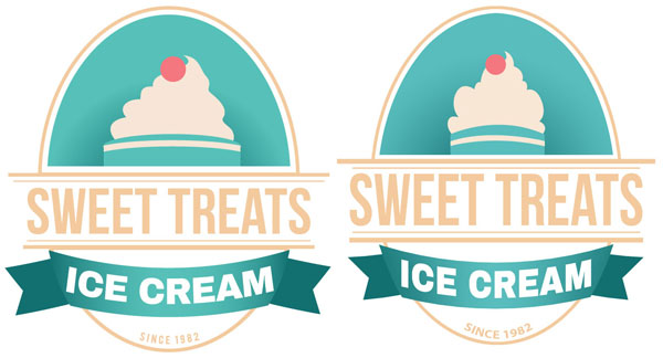
9. Color Variations
Step 1
Color choice is important. I made the background dark gray in this instance so the cream details are visible. Imagine that your logo is being printed in a newspaper or in a magazine, but it won't be printed in color. You'll want to make sure that you've chosen colors for that particular instance so that your brand, product, and other information are still readable.

Step 2
The second variation is simple black and white. I omitted the cherry portion of the design. All gradients were deleted (this is why I placed them on a separate layer from the initial shape), cream became white, and teal and dark teal became black.
Much like the grayscale variation, all salient information is easily read so long as it exists on a gray background. This exercise is useful not only for black and white publications, but also limited color printing in which you may only choose two or three colors.
Finally, seeing your logo design, banner, etc. in this way hammers home what portions of the design stand out the most. In this case it's the ice cream and the words "SWEET TREATS", which are the most important elements of the design since it immediately tells the viewer or consumer what the product or company is.

Well Done, You!
One basic design (created separately, so variations occurred) in two programs. While I prefer using Illustrator for all things logo and design-related, only having access to Photoshop shouldn't limit a designer when it comes to creating similar design sets and artwork. It may make for heavier files and documents, but being able to create vector-like pieces in raster form is a great way to get the most out of a program like Photoshop.

About Mary Winkler
+ Expand Bio The work of Mary Winkler (aka Acrylicana) is vivid and whimsical. It's often child-like in theme, depicting sweets, fanciful creatures and rainbows as well as exploring the world of fashion and garment in illustrated form. Done in a variety of media, including digital, acrylic, watercolour and ink, Mary's work is pop art, graphic and, for lack of a better word, sparkly. Her work is painted on canvas, a variety of papers or printed by way of giclee ink jet or silk screen (usually onto fabric for pouches/bags). Mary studied Illustration at College for Creative Studies in Detroit, Michigan.
Recommended for you

Create a Series of Breakfast Pixel Art Icons in Adobe Photoshop
Design & Illustration

How to Create a Surreal Poster Design in Adobe Illustrator
Design & Illustration

How to Create a Bright Geometric Circle Pattern in Adobe Illustrator
Design & Illustration

Create Two Colorful Children's Book Illustrations in Illustrator
Design & Illustration
No hay comentarios:
Publicar un comentario