30 Useful Infographics for Designers & Developers
There aren't many better ways to gain information these days than infographics. Infographics allow designers and non-designers to compile interesting, important and funny information all into one creative package. An infographic is meant to tell a story and provide information in a visually striking way. You can use an infographic to visually display statistics, facts, data, and anything else.
Today, we've compiled a list of useful and funny infographics for both designers and develoeprs. You'll see things that will make you laugh, and infographics that you can use as a reference sheet on a daily basis.
Funny Infographics for Designers and Developers
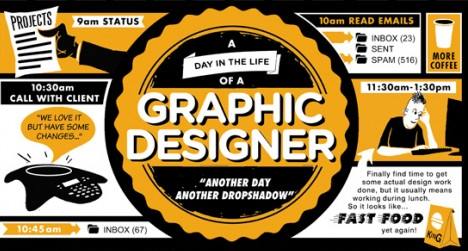
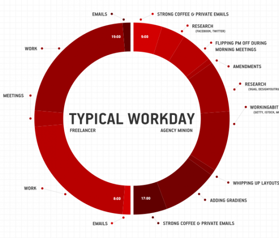
A Day in the Life of a Graphic Designer
Emails, feedback, designing, and more feedback are part of the daily life of a designer. Check out this funny infographic to see if your life is like the one depicted here.
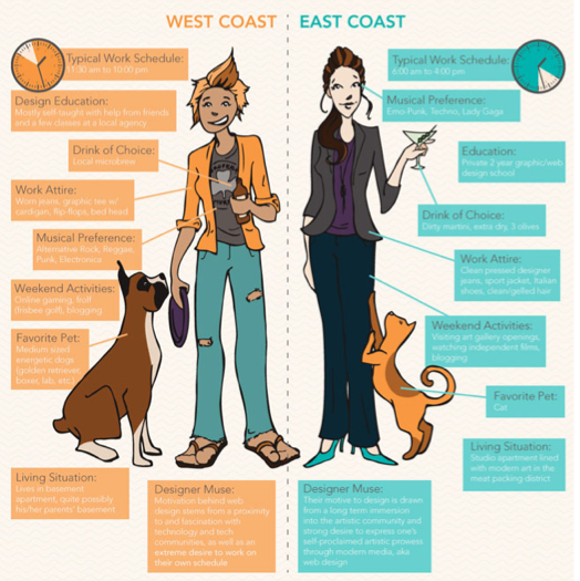
East Coast vs. West Coast Designers
Are you a true East Coast or West Coast designer? This infographic highlights the differences of designers from the two coasts to show us some funny and true differences we can all relate to.
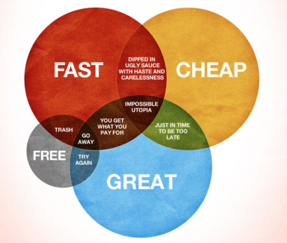
How Would You Like Your Graphic Design?
Keep in mind you can only pick two choices on this infographic. Do you want fast and cheap design or do you want your design great and cheap? See what happens when you select the type of design you prefer...
Your Average Designer
Most designers and developers have similar experiences and traits in common that come with the territory of having a job in the creative industry. This infographiclays out the typical life of a designer and what the normal progression of day-to-day life looks like.
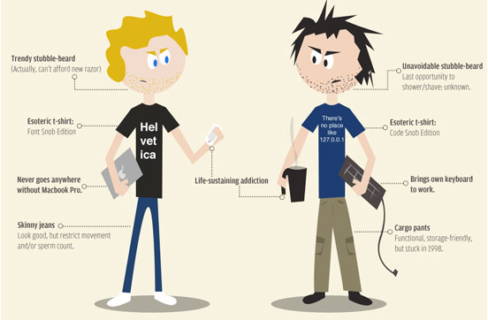
Web Designers vs Web Developers
Ever wonder what sets a web designer apart from a web developer? Do you agree with the differences and similarities depicted in this infographic?
Useful Infographics for Designers and Developers
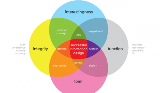
What Makes Good Information Design?
When you visualize information or data there are a few key components to making sure your image does the right job. As this infographic shows, everything from 'interestingness' to 'concept' plays a part in creating an effective an shareable image.
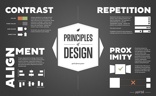
The Principles of Design
Sometimes its important to go back to basics when it comes to design and really remember the most important structural elements of good design. Thisinfographic incorporates some of the basic principles of design to help you remember what to consider in your projects.
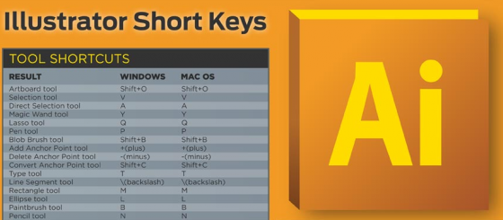
Illustrator Short KEys
Constantly using illustrator but can't remember shortcuts or codes that you need to get the job done more efficiently? This infographic lays out all the shortcuts you need to help you get projects done.
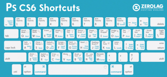
Photoshop Short KEys
Similar to the infographic featured above, this sheet lays out important and useful short keys to use when designing and creating in Photoshop.
Color Infographics
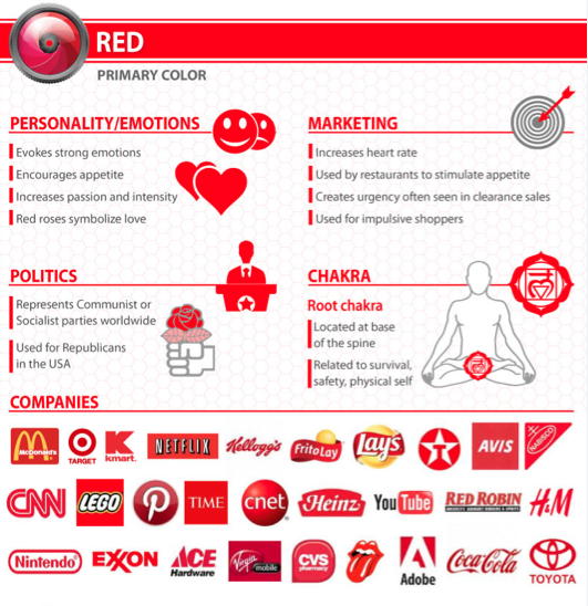
The Psychology of Color
If you've ever been fascinated by the way certain colors are used in certain identity designs and branding, it all comes down to psychology. This infographic breaks down the most common colors and shows how they affect marketing tactics, emotions, and even politics. A handy reference for every designer trying to better understand color choices.
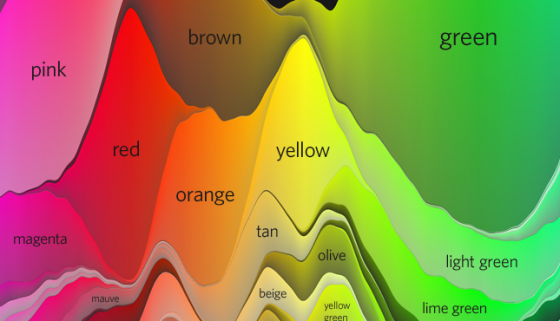
The Color Strata
Ever wonder what colors fit into specific color categories? Is mauve considered a 'brown' or 'purple' color? The Color Strata infographic includes 200 common colors names like teal, peach, lilac, and cyan. You'll easily be able to visualize the relationship between certain color using this infographic and find out the names of colors while you're looking at them.
Color Emotion Guide
Ever wonder what colors elicit specific emotions with your customers? Thisinfographic is sweet and simple, getting straight to the point of which colors are associated with specific emotions like happiness and excitement.
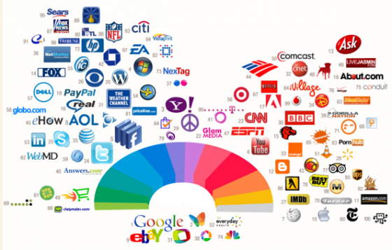
The Colors of the Web
What are the biggest brands out there on the web right now and what colors are they using in their branding and identity? This infographic breaks down the colors of sites with the highest web rankings, and even shows you how brands within the same categories tend to use similar color palettes. If your interested in better understanding how the biggest brands use color, this infographic breaks it down simply for you.
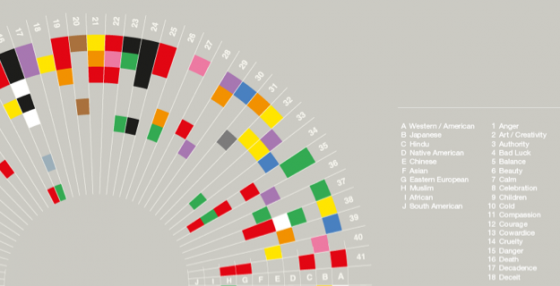
What Colors Mean Across 10 Cultures
Cultural ideologies can often be extremely similar or highly contrasting, and this is no different when it comes to color associations. This infographic highlights the meanings 10 cultures, including North American, Chinese, Hindu, and Native Americans, attribute to different colors. For some cultures, red may signify anger, but in others black is the color associated with feelings of frustration and anger. This useful infographic can help you better understand what cultures associate with different colors so you can be sure to choose appropriate colors in your design projects.
* Please note that for many of the infographics described above the full infographic is not displayed as to save space. Please click through the image or the links to view the complete and entire infographic.
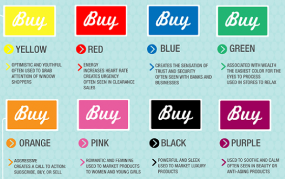
How Do Colors Affect Purchases?
If you're designing a website for a client that has call to action elements or an e-commerce section, this infographic by Kissmetrics is a must have before you begin the design process. Different colors can trigger different emotions or feelings in people, and so it's important to be aware of which colors in design will catch people's attention in a positive or negative way. Use this infographic before you build out a website featuring any "buy" or call to action buttons to make sure your message is heard loud and clear.
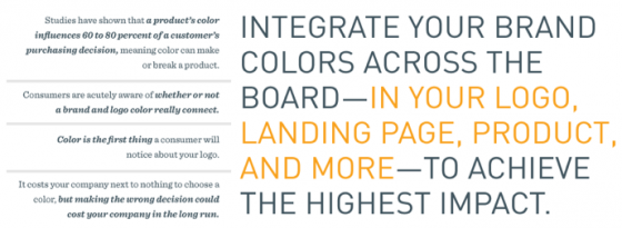
What Your Brand Colors Say About Your Business
According to the Marketo Blog, "the most prominent brands in the world are defined by their colors," and I would have to agree. When you think of a certain brand like Coca-Cola you immediately associate them with a red can of soda, or McDonalds with the yellow "M" arch. If you're branding your own company, or making a design for a client consider the use of color throughout your identity design. This infographic will help you better understand what companies are presently using certain colors and how we associate certain colors with specific meanings.
RGB vs. CMYK
Have you ever had trouble understanding the difference between CMYK and RGB? Now, you can better understand the basics, as well as pros and cons of these color systems with this infographic.
Typography Infographics
A Brief Introduction to Typography
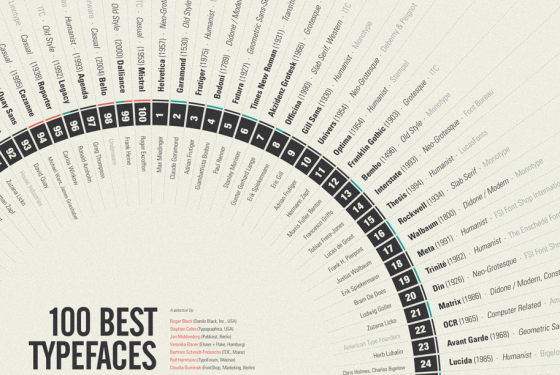
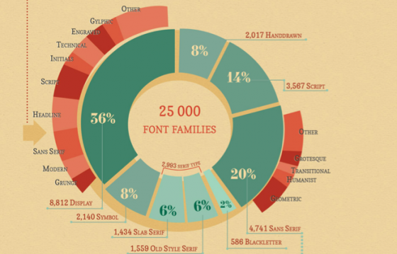
If you're looking for a breakdown of the top 100 fonts, how to understand font classification, and a basic introduction to typography, this infographic really has it all!
A Quick and Comprehensive Type Guide
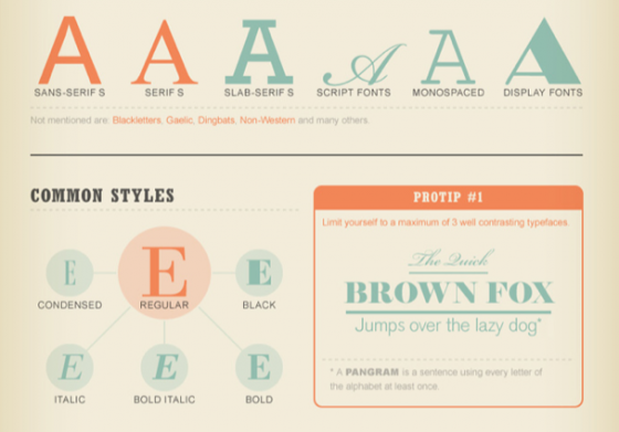
What are monospace, scrip serif, slab serif, and display fonts? This infographicexplains all the different styles of type and even helps you determine with typeface is best for different aspects of design. For example, rounded typefaces are more user friendly and script fonts are more elegant.
Bold and Justified
This infographic from Creative Market breaks down everything from font types and styles to a history of typefaces. It's a great reference for every designer and anyone interested in typography just to learn more about the craft of using and designing typefaces.
A Dummy's Guide to Typefaces
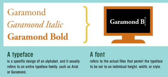
Did you know there's a difference between typefaces and fonts? This infographicnot only explains the difference but it outlines the anatomy of a typeface, and explains the its individual components so that you can better understand how typefaces and fonts work.
Serif vs Sans - The Final Battle
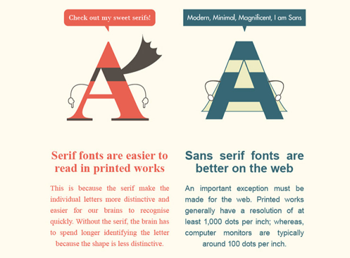
Having trouble understanding the difference between a serif and sans serif font or just not sure when it is more appropriate to use one over another? This infographicbreaks down whether serif or sans seif fonts are better for web or print, and when it's most appropriate to use one over another.
The Psychology of Fonts
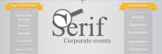
Have you ever wondered what font to use in your design and why...if so, thisinfographic breaks down the top font styles, and common associations people have with them. For example, when someone sees a serif font they automatically think of concepts like traditional and reliable. Whereas, script fonts are thought to be more feminine and elegant.
So, You Need a Typeface?
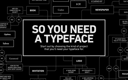
Working on a design for print, an online newspaper, an infographic, or greeting card but not sure which typeface will be best? This infographic walks you through a step by step Q&A guide to help you determine with typeface is best for your project.
Web Design Infographics
2013 Web Design Trends
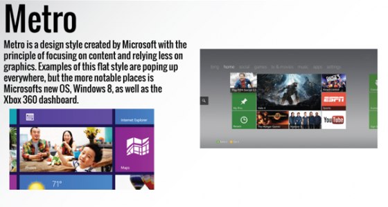
We've all seen things like responsive and flat design trending around the web, but now you can see the latest trends in web design all in one place. This infographicneatly lays out what different web trends look like, and how they're used.
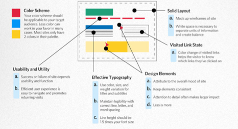
Anatomy of an Effective Web Design
What makes a web site stand out above the rest? How is a web page effective and actually get a high conversion rate? This infographic breaks down the basic elements to help you make sure that your web page is in tip top working order for the highest conversion rates.
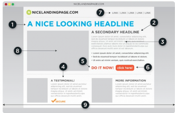
Anatomy of a Perfect Landing Page
When it comes to creating just the right landing page that converts and that helps you gain customers, there are certain key elements that you need to incorporate on your homepage. This infographic details everything from creating elegant and catchy headlines to optimizing the page for certain keywords.
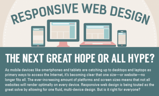
Responsive Web Design
Are you one of the people on-board with the responsive web design trend? Find out everything you need to know about responsive web design on the rise with this infographic.
Ultimate HTML Cheatsheet
There can be so many tags and wrods that are hard to keep track of when it comes to HTML. Sometimes its hard to know when to use a certain word and how to get the desired effect you want from HTML. This infographic is the perfect cheat sheet to for all of your HTML coding needs.
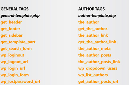
Ultimate WordPress Cheatsheet
Similar to the ultimate HTML cheatsheet above, this WP cheatsheet for helping you use and understand the basics of WP and which tags and keywords you need to use to complete certain actions.
Make Your Own Infographic
Interested in making your own infographic? Here are some awesome tools from Creative Market to help you make stunning infographics without pain for frustration. You'll quickly be able to display your data and info beautifully with these tools.
Source: https://creativemarket.com/blog/2013/08/12/30-useful-infographics-for-designers-developers?utm_source=CMtwitter&utm_medium=tweet&utm_campaign=blog_30-useful-infographics-for-designers-developers




No hay comentarios:
Publicar un comentario